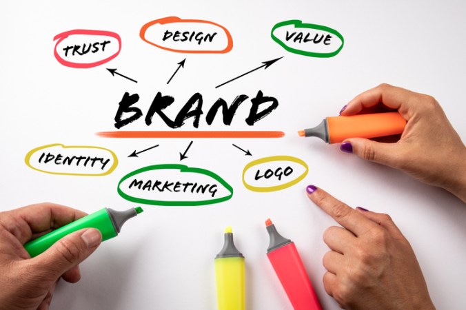
How to Keep Brand Value

Your brand is everything.

It’s what makes potential buyers and customers recognize you and helps set you apart from competitors.

It’s important to maintain the value of your brand in order to make the most of your business marketing. Keeping brand focus and consistency is key. If customers know what your brand stands for, they’ll end up appreciating it more, and you’ll gain more organic traffic.

A strong brand value helps tell your company’s story, creating awareness, loyalty, and excitement for the consumer.

Sales and marketing trends will continually change over time. However, building the power of your company’s brand is an investment that pays for years to come.

3 Ways to Keep Your Brand Value

1. Business Visuals

Your logo is at the forefront of your company.

Anyone who knows your business knows what your logo looks like, including the color palette, typography, imagery, and graphic elements. These brand visuals are most important to maintain throughout your business advertising.

When marketing for your business, continue to use these same characteristics of your logo throughout. Over time, after creating enough brand awareness, you should simplify your logo, and people will still know exactly who you are. For example, the Chevrolet logo doesn’t need the word “Chevrolet” next to it for people to know who they are. They’ve been around long enough and created a strong brand value to be able to pull that off.

2. Business Values and/or Mission

Brand values and/or the mission of your business are just as important to show and maintain as the logo characteristics.

Use your values to strengthen your advertising, show what you stand for, and create awareness. When people see an advertisement, they should be able to tell what company it’s for before even showing a logo or a name.

3. Business Style

Your company’s style fits in with your brand value and is important to maintain across all marketing consistently.

Does your building’s interior design use a modern appeal or more of a rustic look? Does your website use a white and clean look or a dark and textured theme? Use this style as a part of your print marketing and other advertising. 

The Ultimate Marketing Combination

All of these things; your logo, values, and style all play an important role in maintaining brand value.

Used often and strategically, these brand elements will help strengthen your brand so that your business is better known, and you’ll gain more traffic online and in person.

Do Your Print Marketing Materials Need an Upgrade?

There is a great deal of time, effort, and energy placed into updating your print marketing materials.

You need to cover all the relevant information in a very limited space. This means you need to fully optimize your messaging and make sure your materials attract attention.

With all this thought going into ensuring packaging and flyers and postcards are fantastic, you may be unwilling to make regular updates. Unfortunately, this can allow your message to become stale or even allow inaccurate information to be shared with customers over time. 

Time to Make a Change! 

Donna, a local florist, realized it had been more than 6-8 months since she reviewed and revised the messaging on her printed materials.

She knew it was probably time to make some tweaks. Businesses can change dramatically over time, with shifts in hours of operation, updated special offers, and more making an appearance. 

Regular reviews to ensure your messaging is still on point helps keep your marketing materials fresh and interesting for repeat customers. Plus, it ensures that any new prospects have your best offer in front of them at all times.

Donna worked with her local print shop to update her messaging, and her customers certainly noticed! She received many positive comments and new clients from an updated postcard and flyer combination that she designed and had printed locally.

Update Graphics and Colors

Has your logo evolved a bit over time?

It’s not unusual to spread out all of your marketing materials on a table and find that you have several iterations of logos or color schemes represented. Viewing your marketing materials together as a whole can add necessary cohesion to your brand. 

While you may not want to follow on-trend color schemes or make changes based on the seasons, you may want to do a quick update to your color palette. Ensuring that your brand look stays fresh and current is an important part of brand management. 

Put Your Best Offer Forward

Are you placing your very best offer in front of clients and prospects? Do you need different offers for individuals at various stages of the buying journey?

Now is a great time to look at your audience segments and see if you can fine-tune any graphics for eye appeal while meeting their unique needs.

Whether you’re looking for options to create branding materials for a new company or simply refreshing your current options, your local print shop is here for you! We work with organizations of all sizes to ensure you have access to exceptional resources to promote your brand. 

Go Print When a Presentation Matters Most

Given the restrictions of 2020 thanks to COVID, the term “slidedeck” has probably entered everyone’s vocabulary far more than they care to know.

With nearly everyone spending at least three hours a day online in digital meetings, digital slide presentations have become commonplace. However, that doesn’t mean going digital is the best choice for those decision-making events.

The Tangibility of Print

The standard for a powerful presentation has been and continues to be the professionally printed presentation package.

Why? In a word – tangibility.

People are tactile creatures, especially when making big decisions that have significant ramifications. Print presentations finished in high-quality stock and graphics meet that innate drive to have something physical in hand before making a big commitment.

3 Reasons Digital Falls Short on Presentations

Going digital with your presentation with a digital slidedeck doesn’t have the same effect on people as print. Here are three reasons digital falls short in this way.

1. Digital Overload

Most audiences are now suffering from digital overload.

You don’t have to go far to hear the constant complaining about having to chew through 50 to 300 emails a day, thanks to an over-reliance on digital communication.

What kind of attention are your presentation attendees going to have left to click open and read through another digital presentation, no matter how well done? 

2. Easily Manipulated Digital Content

Digital files can be easily manipulated, especially if they are going through multiple hands to get to the presentation party.

Many assume that by converting a slidedeck to a PDF format, the file will be protected and its integrity kept the same. This is a false hope. Without a fully encrypted form protection, the file can be tampered with. And when a presentation matters, the sender should make sure the content isn’t tampered with from the version sent to the version being presented.

3. The One-and-Done Digital Dilemma

What happens when a digital presentation is complete?

Does the recipient in a meeting save the digital slidedeck for future reference? It’s unlikely.

Most people just hit the delete button, hoping someone else has a copy if they actually need it again down the line, or hope that it was saved in their email folder. The likelihood of someone reopening a digital slidedeck to read its content completely is highly unlikely given the digital blur most people are under today.

Capture Attention with Print Presentations

A print presentation on high-quality stock makes a huge difference in all of these situations.

People have something tangible to read and hold that isn’t a computer screen. In fact, a professionally finished presentation in print is probably unique and an immediate stand-out in 2021.

And, the presentation can’t be faked, fudged, or tampered with without ruining the package in total. The same can’t be said for a digital file.

Finally, people do actually look at print material repeatedly after seeing it for the first time. If the document isn’t discarded right away, most folks will reread the package before deciding whether to file it, scan it, or recycle it. And that means your message sink in even deeper. 

When a presentation matters, deliver it in print!

Add Zest to Summer Designs with 10 Hot Color Combos

It has been said that color is a power that directly influences our soul.

A common obstacle for designers is choosing colors. And you should not take this choice lightly! There is great energy in certain combinations – a good color palette will be unique, seductive, and harmonious.

Warmer seasonal temps offer a great chance to color outside the lines with playful, lavish options. Need inspiration? Here are a few feisty blends for your summer design toolbox:

10 Feisty Blends for Your Summer Design Toolbox

1. Cool Gray – Neon Orange – Plum Purple

These call-to-action colors bring a sense of health and vibrancy, with an air of sophistication and an invitation to adventure.

2. Magenta – Vibrant Turquoise – Black

Fire up confidence with bright shades that bring flavor and fun!

3. Sapphire Blue – Shadow Gray – Neon Yellow

Like a bright peacock feather, this gorgeous blue-green combination brings a royal, confident air to any page.

4. Bright Green – Dark Violet – Lava Gray

Like a sunset dip in the Caribbean, these rich colors satisfy the soul in a lush, confident array.

5. Flaming Fuchsia – Black – Sandy Tan

Want to steal the stage with your design? The bold contrasts in this palette exude vibrance, feminine strength, and a rugged road for the journey.

6. Solar Yellow – Electric Blue – Charcoal

When you want to add punch to your page, the rich extremes of this triad bring a fluorescent finish that is fierce yet fun!

7. Pearl Aqua – Cyber Grape – Daisy Yellow

These colors bring a burst of energy with bright hues and an interesting, sophisticated contrast.

8. Lime Punch – Cool Gray – Tangerine

Heat up appetites with this tropical, zesty arrangement that will compel people to give your business a try!

9. Terra Firma Green – Magenta – Sunlight Yellow

Like interwoven threads of a tribal mosaic, the sharp contrasts in this palette bring a sense of depth, mystery, and variety.

10. Carnation – Dark Lilac – Peachy Rose

Like a seashell deposited on a white-washed beach, this royal blend awakens a sense of purity and opulence, projecting an air of poise and splendor.

Find Your Favorites in Nature

Still looking for just the right summer designs blend? The natural world is a great place to look.

— The sunset is not just orange; it is apricot, bronze, mauve, and amber.

— A tropical beach is not just blue; it is turquoise, coral, tan, and chartreuse.

— A poplar tree is not just green; it is a mix of jungle green, lime, silver-green, light brown, cool gray, and white.

When you find a natural image that inspires you, snap a photo and take it to the drawing board. Sample distinct colors from different parts of the photo and examine which hues move you the most. Most compelling swaths from nature include a system of colors ranging from dark to light and intense to soft. Find what is unique and powerful about these grand images and replicate them in your own seasonal designs.

The psychological association of a color can often be more potent than a visual impression. So be intentional (but brave!) with your summer designs palettes, and let these blends sell for you!