5 Print Marketing Pieces that will Woo Your Corporate Clients

Some of the most effective ways of communicating value don’t require looking up a website or downloading a mobile device teaser program.

In fact, non-digital marketing activities win over corporate clients regularly without ever needing to be plugged in. Here are five of them.

1. Business Cards

Yes, those traditional business cards are still winners.

Business cards provide critical contact information and enough detail on how to connect with an organization quickly. Whether by email, text, phone, or mail, the info on a business card is powerful.

People love business cards because they are easy to transfer, pack, save, and reference. In the corporate world, business cards still resonate.

2. Letterheads and Stationery

In a day and age when so much communication happens by email and texting, the traditional letter stands out, even in a mail pile full of folders and generic material.

Best used when conveying a personal connection, professional letterhead is loved by corporate leaders everywhere and often seen as a sign of respect to the reader.

3. Add to Your Digital Slidedeck

Digital presentations can be so commonplace that people are often bored to death by the lack of engaging multiple senses.

A quick fix? Add printed materials people can hold in their hands that support your digital presentation. A beautifully printed presentation contained in a clean and stylish folder is easy to carry and review hands-on later. Combine a print version of a presentation with a digital slidedeck, and you’re hitting a home run with both formats simultaneously.

4. Company Information Brochures

A tri-fold company brochure is a convenient marketing tool that easily fits in a jacket pocket or folder. And, like business cards and presentation folders, brochures engage multiple senses of sight, touch, and even smell. 

Unlike digital PDFs, professionally printed brochures can be visualized and held easily. They don’t get lost in files like emails and tweets. A well-done brochure with high-impact visuals gets shared with those who matter as well. They are often shown as an example of what’s possible with the right skills hired.

5. Everyone Loves Catalogs

Today, digital menus and scrolling lists have tried to replace catalogs online.

However, the traditional catalog publication stands firm because of its tremendous impact.

Sometimes, folks like to leaf through a well-designed paper catalog to relax and pass the time, which often triggers more sales.

Additionally, companies that provide catalogs are becoming more unique and a stand-out factor from the crowd. Folks do not always remember a general product, but they definitely remember who has a catalog.

Add Zest to Summer Designs with 10 Hot Color Combos

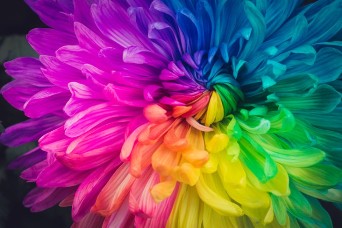
It has been said that color is a power that directly influences our soul.

A common obstacle for designers is choosing colors. And you should not take this choice lightly! There is great energy in certain combinations – a good color palette will be unique, seductive, and harmonious.

Warmer seasonal temps offer a great chance to color outside the lines with playful, lavish options. Need inspiration? Here are a few feisty blends for your summer design toolbox:

10 Feisty Blends for Your Summer Design Toolbox

1. Cool Gray – Neon Orange – Plum Purple

These call-to-action colors bring a sense of health and vibrancy, with an air of sophistication and an invitation to adventure.

2. Magenta – Vibrant Turquoise – Black

Fire up confidence with bright shades that bring flavor and fun!

3. Sapphire Blue – Shadow Gray – Neon Yellow

Like a bright peacock feather, this gorgeous blue-green combination brings a royal, confident air to any page.

4. Bright Green – Dark Violet – Lava Gray

Like a sunset dip in the Caribbean, these rich colors satisfy the soul in a lush, confident array.

5. Flaming Fuchsia – Black – Sandy Tan

Want to steal the stage with your design? The bold contrasts in this palette exude vibrance, feminine strength, and a rugged road for the journey.

6. Solar Yellow – Electric Blue – Charcoal

When you want to add punch to your page, the rich extremes of this triad bring a fluorescent finish that is fierce yet fun!

7. Pearl Aqua – Cyber Grape – Daisy Yellow

These colors bring a burst of energy with bright hues and an interesting, sophisticated contrast.

8. Lime Punch – Cool Gray – Tangerine

Heat up appetites with this tropical, zesty arrangement that will compel people to give your business a try!

9. Terra Firma Green – Magenta – Sunlight Yellow

Like interwoven threads of a tribal mosaic, the sharp contrasts in this palette bring a sense of depth, mystery, and variety.

10. Carnation – Dark Lilac – Peachy Rose

Like a seashell deposited on a white-washed beach, this royal blend awakens a sense of purity and opulence, projecting an air of poise and splendor.

Find Your Favorites in Nature

Still looking for just the right summer designs blend? The natural world is a great place to look.

— The sunset is not just orange; it is apricot, bronze, mauve, and amber.

— A tropical beach is not just blue; it is turquoise, coral, tan, and chartreuse.

— A poplar tree is not just green; it is a mix of jungle green, lime, silver-green, light brown, cool gray, and white.

When you find a natural image that inspires you, snap a photo and take it to the drawing board. Sample distinct colors from different parts of the photo and examine which hues move you the most. Most compelling swaths from nature include a system of colors ranging from dark to light and intense to soft. Find what is unique and powerful about these grand images and replicate them in your own seasonal designs.

The psychological association of a color can often be more potent than a visual impression. So be intentional (but brave!) with your summer designs palettes, and let these blends sell for you!