The Do’s and Don’ts for how to take great photos with iphone.

When it comes to great print marketing, high-quality images can make all the difference.

Since most people today have a smartphone they use for taking pictures rather than a digital camera. You may be asking how to take great photos with iphone? Here are five do’s and don’ts for taking better pictures with your iPhone.

DO’S

1. Do use portrait mode when capturing pictures that focus on people.

Many forget to make good use of the portrait mode when capturing a friend or family member. Portrait mode will focus on the person only and blur out the background. This mimics the effect that a professional camera reflects.

2. Do keep your “live” feature on when taking pictures of moving objects or people.

Using the “live” feature comes in handy for things or people that move quickly, for instance – a busy baby or a sports game. After the live picture is captured, you will be able to go back, edit the picture, and choose which frame you’d like to be the key photo.

3. Do make sure your camera lens is not foggy or smudged.

This is something that is commonly overlooked when pulling your phone out to take a picture. Wiping off the lens with a cloth or t-shirt will make a marvelous difference in the clarity of your picture.

4. Do use the “auto” edit wand for each picture.

It’s as easy as it sounds! Clicking that auto edit wand will do wonders on your pictures if you don’t know where to start. It’ll auto-adjust the white balance, color tone, exposure, etc.

5. Do use natural lighting for better color and clarity.

Use sunlight at every chance you get. The more natural lighting you use, the less grainy your images will look. For example, standing near a window when indoors will allow natural lighting to come into your picture.

DON’TS

1. Don’t use the front camera for anything except selfies.

The front camera on an iPhone is usually a lower megapixel than the rear-facing camera. The images taken with the front-facing camera will turn out more “grainy” than images captured with the rear-facing camera.

2. Don’t stick to the default filters that Apple provides.

There are many other filters available, especially on Lightroom and for purchase, that provide better color for your pictures.

3. Don’t expect as high of quality when using iPhone pictures at a larger scale.

iPhone has a great camera, but it can’t be compared to a $2,000+ DSLR camera. If you’re looking to enlarge a picture for a canvas or banner, it’s best to rely on the use of a professional camera rather than a smartphone.

After following these tips on how to take great photos with iphone, your iPhone pictures will be worth more than a thousand words. And, when you’re ready to get those pictures out to the world through great print marketing, give us a call!

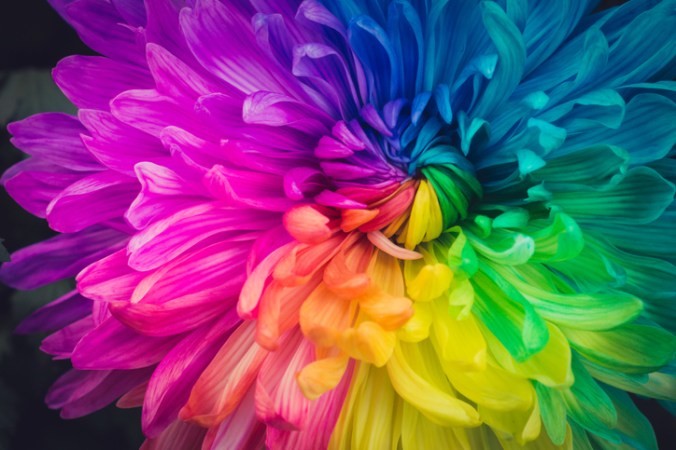
Add Zest to Summer Designs with 10 Hot Color Combos

It has been said that color is a power that directly influences our soul.

A common obstacle for designers is choosing colors. And you should not take this choice lightly! There is great energy in certain combinations – a good color palette will be unique, seductive, and harmonious.

Warmer seasonal temps offer a great chance to color outside the lines with playful, lavish options. Need inspiration? Here are a few feisty blends for your summer design toolbox:

10 Feisty Blends for Your Summer Design Toolbox

1. Cool Gray – Neon Orange – Plum Purple

These call-to-action colors bring a sense of health and vibrancy, with an air of sophistication and an invitation to adventure.

2. Magenta – Vibrant Turquoise – Black

Fire up confidence with bright shades that bring flavor and fun!

3. Sapphire Blue – Shadow Gray – Neon Yellow

Like a bright peacock feather, this gorgeous blue-green combination brings a royal, confident air to any page.

4. Bright Green – Dark Violet – Lava Gray

Like a sunset dip in the Caribbean, these rich colors satisfy the soul in a lush, confident array.

5. Flaming Fuchsia – Black – Sandy Tan

Want to steal the stage with your design? The bold contrasts in this palette exude vibrance, feminine strength, and a rugged road for the journey.

6. Solar Yellow – Electric Blue – Charcoal

When you want to add punch to your page, the rich extremes of this triad bring a fluorescent finish that is fierce yet fun!

7. Pearl Aqua – Cyber Grape – Daisy Yellow

These colors bring a burst of energy with bright hues and an interesting, sophisticated contrast.

8. Lime Punch – Cool Gray – Tangerine

Heat up appetites with this tropical, zesty arrangement that will compel people to give your business a try!

9. Terra Firma Green – Magenta – Sunlight Yellow

Like interwoven threads of a tribal mosaic, the sharp contrasts in this palette bring a sense of depth, mystery, and variety.

10. Carnation – Dark Lilac – Peachy Rose

Like a seashell deposited on a white-washed beach, this royal blend awakens a sense of purity and opulence, projecting an air of poise and splendor.

Find Your Favorites in Nature

Still looking for just the right summer designs blend? The natural world is a great place to look.

— The sunset is not just orange; it is apricot, bronze, mauve, and amber.

— A tropical beach is not just blue; it is turquoise, coral, tan, and chartreuse.

— A poplar tree is not just green; it is a mix of jungle green, lime, silver-green, light brown, cool gray, and white.

When you find a natural image that inspires you, snap a photo and take it to the drawing board. Sample distinct colors from different parts of the photo and examine which hues move you the most. Most compelling swaths from nature include a system of colors ranging from dark to light and intense to soft. Find what is unique and powerful about these grand images and replicate them in your own seasonal designs.

The psychological association of a color can often be more potent than a visual impression. So be intentional (but brave!) with your summer designs palettes, and let these blends sell for you!

How to Inspire Action with Highly-Engaging Postcards Marketing

What do dentists and direct mail have in common?

New clients! Direct mail has proven to be a remarkable investment for small businesses of many kinds, especially for entrepreneurs looking to grow their client base.

Dr. Diep Truong (of Viva Dental) gave direct mail postcard marketing a try in 2011. After streamlining a process for mailer design, demographic targeting, and ROI reporting, this Indiana-based facility consistently experienced a 400% ROI on their postcard campaigns, with a 50% conversion rate of inbound calls for scheduling appointments.

As 2020 kept people closer to home, attentiveness to direct mail has grown. As a result, response rates are high, and now is the time to invest in sharp, unique direct mail campaigns! Postcards are a particularly good investment, with oversized postcards garnering one of the highest direct mail response rates.

According to recent statistics, 23.4% of consumers say they would respond to relevant postcards of interest to them (compared to 7.9% for letter-sized envelopes).

Ready to wade into the water of a new postcard campaign? Here are a few steps to success in 2021:

Take a Multi-Pronged Approach

One of the biggest trends direct mail is seeing is the consolidation of online and offline advertising.

Take a multi-pronged approach to generating leads, so your social media ads prompt curiosity, but your print ads pack some punch with greater neurological impact.

Keep it Simple and Succinct

People are busy, and if they’re going to look at your mail, they’ll need a good reason.

Make sure your postcard leaps off the counter with unique imagery, splashy colors, a memorable catchphrase, or an unbeatable offer. And remember, when it comes to direct mail, less is more. Postcards that are sharp and straightforward will communicate much more than those packed with content.

Grab Emotions

According to one Harvard marketing study, 95% of purchasing decisions are made subconsciously.

If people’s hearts are in the driver’s seat, then direct mail should aim straight at this target. Research shows that the primary emotional appeals that prompt action are:

  • Fear
  • Greed
  • Anger
  • Guilt
  • Flattery
  • Exclusivity
  • Salvation

Experiment with Specialty Branding Features

Because postcards are so economical, there’s lots of room to add embellishments.

Try haptic coatings, embossed logos, foil-flecked accents, or even scents.  When Sunsilk co-creations wanted to snag more customers, they decided to add an experiential element to their designs. Its gorgeous lime and hot pink postcards came with a tiny shampoo sample attached and a scented trial as well: “scratch to smell the new fruity fresh fragrance of this apple-coconut shampoo!” Customers may not sniff shampoo in the store aisle, but a scented postcard is irresistible!

Specialty branding makes a stronger impression on readers as they physically interact with your marketing. So build curiosity and engagement with these fresh, creative designs.

Postcards Marketing Inspire Action

Postcards are distinct, direct, and easy to read.

50.9% of people say they find postcards useful, and direct mail as a whole is especially inspiring to young people. Because many people today are glued to their phones, millennials, in particular, say that postal mail inspires them to action much more often than email (in fact, 30% say direct mail is effective in getting them to visit a website, go to a store, or make a purchase).

When you are ready to take your postcard marketing efforts to the next level, sign up for a personal consultation with one of our mailing experts. Our work-in-progress partnership will simplify each step and position your business for maximum impact!

How Print QR Code Cards are Marketing Genius

Business cards, postcards, and other print marketing pieces with QR codes can be extremely effective in developing support for your business, especially when starting from the ground floor.

Utilizing the Graphic Ease of a QR Code

The QR code is ideal for an immediate and instant connection to a large range of audiences because it doesn’t require a lot of comprehension.

Instead, the technology behind the QR code uses what people are already carrying, a smartphone or image-reading mobile device. So, all that needs to be done is for your audience to use the mobile device camera and capture the QR code. Then, it automatically provides a hyperlink to the given digital information associated with the specific image.

Effective Communication

Unlike QR images on doors, posters, or websites, did you know the QR code on a card or postcard can actually be retained better?

While one QR code can easily be scanned right away, the problem is when a viewer has multiple QR codes to deal with. They start scanning and clicking, and soon enough, the first code is forgotten, and the second or third becomes the attention focus.

However, with a business card or postcard, one can store it quickly and then remember it again later when there’s more time. That retention often makes printed QR code handouts far more effective overall from a marketing perspective.

Affordable and Budget Competitive

One of the best advantages of printed QR code postcards and business cards is how cost-effective they are.

Small businesses and cost-conscious larger players can all take advantage of print orders for low market expenses and high-impact results.